I guess I am somewhat obsessed with signage and typography wherever I am, but there is something about signs in Japan that I find endlessly attractive. In part this may be because we spend a lot of time walking the streets when we are in the country. This really is the best way to explore a place, and the distances are often not huge despite what it might look like on a metro map...much like London really.
Kiyomizu-dera, Kyoto
OK, let's start with the alphabet, its as good a place as any. Actually, we need to start with alphabets, because Japan, as ever, doesn't make this simple. Here's Wiki to help us...
“The modern Japanese writing system is a combination of three character types: logographic kanji, which are adopted Chinese characters; syllabic kana; and in some cases the Latin script (rōmaji). Kana itself consists of a pair of syllabaries: hiragana, used primarily for native or naturalised Japanese words and grammatical elements, and katakana, used primarily for foreign words and names, loanwords, onomatopoeia, scientific names, and sometimes for emphasis. Almost all Japanese sentences contain a mixture of kanji and kana. Because of this mixture of scripts, in addition to a large inventory of kanji characters, the Japanese writing system is often considered to be the most complicated in use anywhere in the world.”
Near Sanjusangendo, Kyoto
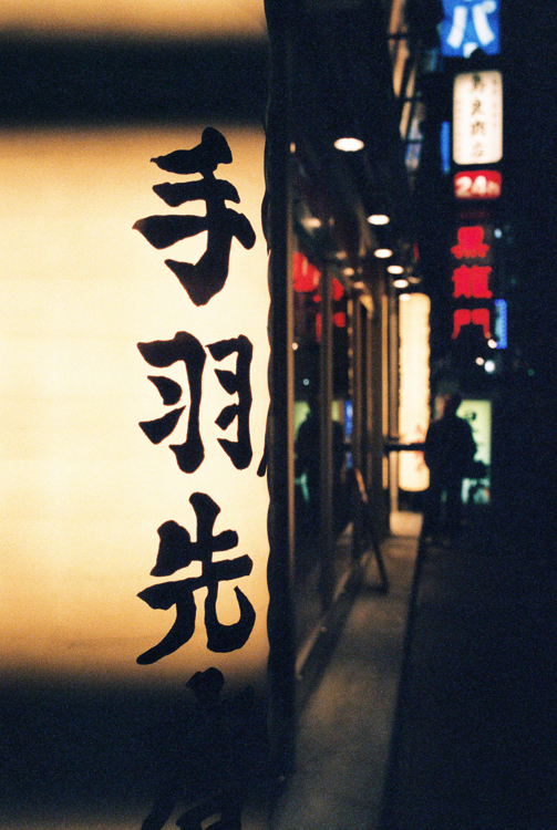
Suffice to say that, with my usual customary laziness, I have not even attempted to begin to learn any of the alphabets. Apart from the latin obviously, I can manage that. However, this flexibility of alphabet does lead to variety in signage, although it does seem that Kanji predominates. Even then though, the execution of the alphabet varies depending on the object and the whim of its creator. Much like the use of a serif or san-serif font for latin characters...nevermind the seemingly endless font choice once you have made that initial decision.
Outside Todai-ji, Nara
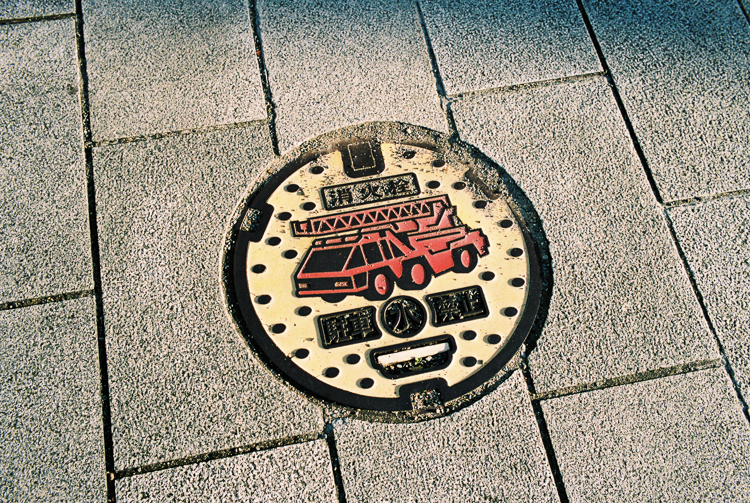
Of course regardless of alphabet and font used, some signs are pretty simple to understand thanks to a common visual language - I give you the ubiquitous fire extinguisher (boxed of course) and bucket. There are a lot of wooden buildings in Japan so you see these frequently. Its also pretty easy to tell when a manhole cover is used for access to a fire hydrant.
Manhole cover, Uji (I think)
Of course, it is very possible I have misinterpreted these signs. Perhaps the local fire department sponsors this manhole cover. Perhaps if we'd looked around we would have seen different designs. We didn't do that search, although I should note here that A is a little obsessed with manhole covers but that's another story for another day. What this does show though, is an ability to make even the mundane seem interesting through the use of good design and a splash of colour.
Postbox, Kagurazaka
This design continues to the humble post box. Outside a store in Kagurazaka, with a beautifully overgrown main sign, some lovely wooden signs, sits this humble box. There's something marvellous about the faded colour and simple logo.
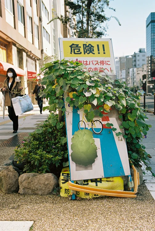
Asakusa-dori, Tokyo
I've probably noted before that plant life is pretty ubiquitous in Japanese towns. It almost seems like the residents see it as an obligation to ensure that there is greenery throughout, and particularly outside houses. This is the case even if the growth eventually overcomes what I believe is a very important sign telling you exactly where to ride your bicycle. Its this kind of lax attitude to health and safety that leads to accidents!
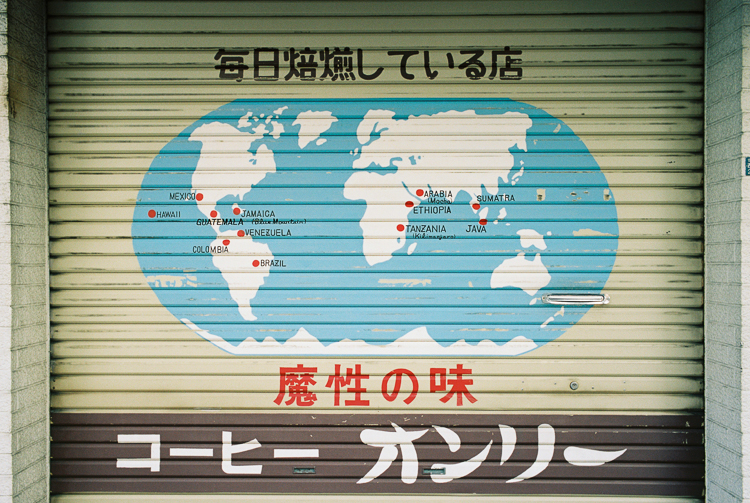
Shop front, Kappabashi-dori, Tokyo
Fortunately many shop fronts are well shuttered if the store is not open, which leads to another opportunity to make the mundane a little more interesting. In case of any doubt, this is (I speculate) a coffee store, probably a wholesaler or roaster given the location. Of course, here we see a mixture of fonts and alphabets, designed I assume to confuse the tourist. Not all shop fronts are so confusing, which is just as well really.
Kagurazaka, Tokyo
Here we can be fairly confident that entering the store will, at a minimum, provide some kind of sustenance, most likely alcoholic (the sake bottles being a key giveaway). The other giveaway is the curtain, or noren. These are often found on restaurants and bars, with the opportunity generally being taken to advertise the shop (at least, I speculate, again, that to be the case).
Shimo-kitazawa, Tokyo
So this one is also pretty obvious, thanks again to the use of a common visual language. In this case the little infographics of the wineglass, carrot, coffee cup, musical notes etc. help you identify the establishment being advertised. I'm also guessing that the helpful robot is pointing to the place. I am less sure why robot image is used, although I do note that he is wearing a neckerchief making me expect she is a chef (I am less sure of the robot's gender).
At night, Fukuoka
Our robot friend does bring us to the other aspect that makes Japan's signage so attractive. It is, at least to me, endlessly futuristic. This was used to great effect in Bladerunner, where Ridley Scott clearly used the night-time atmosphere of Asian cities to create a dystopian vision of the future. I should, of course, acknowledge that although Bladerunner has always seemed Asian to me it could equally be anchored in New York or other major cities across the world.
A familiar sign, Ikebukuro
Even the familiar seems futuristic at night, and when kanji and kana are added the effect seems to be enhanced. I have fallen in love with wandering the safe streets of Japan, camera in hand, to try and capture the atmosphere. I'm not sure I have really succeeded, but it is clear to me that much of the atmosphere is created by the illumination and noise. Ikebukuro is a case in point, this is my favourite district of Tokyo. Mainly this is because it is off the beaten track, and ever so convenient, but it does have something special at dusk and beyond. I attribute this to the station being a major transport hub, which makes me think many stop for food and other entertainment on the way home.
A less familiar sign, Ikebukuro
That Ikebukuro is a major centre for Otaku (geek) culture also helps give it that special something. There are lots of narrow streets crammed not just with bars and eateries but also with karaoke venues, game stores, capsule machines and maid cafes. As you get closure to Otome road you also find places targeted at female Otaku, Cafe Swallowtail (a butler cafe) being a case in point. Of course, we have not ventured into either a maid or butler cafe, the experience would probably be interesting but perhaps a little too odd (unlike a cat cafe which is a definite must).
Parco, Ikebukuro
Speaking of odd, I shall leave you with this image of an egg. I watched this animated billboard for a while and have no idea what was going on. I guess that means the sign was not as effective as it could have been but it sure added to the atmosphere (as did the accompanying soundtrack). We'll come back to Ikebukuro in my next post and see if I can somehow get back on track with talking about signs.
As usual, kudos to Canadian Film Lab for the brilliant work on my film (which is either Portra 160 or Natura 1600).


